
Leadhub: a digital rebrand of the website and app, built on a shared design system

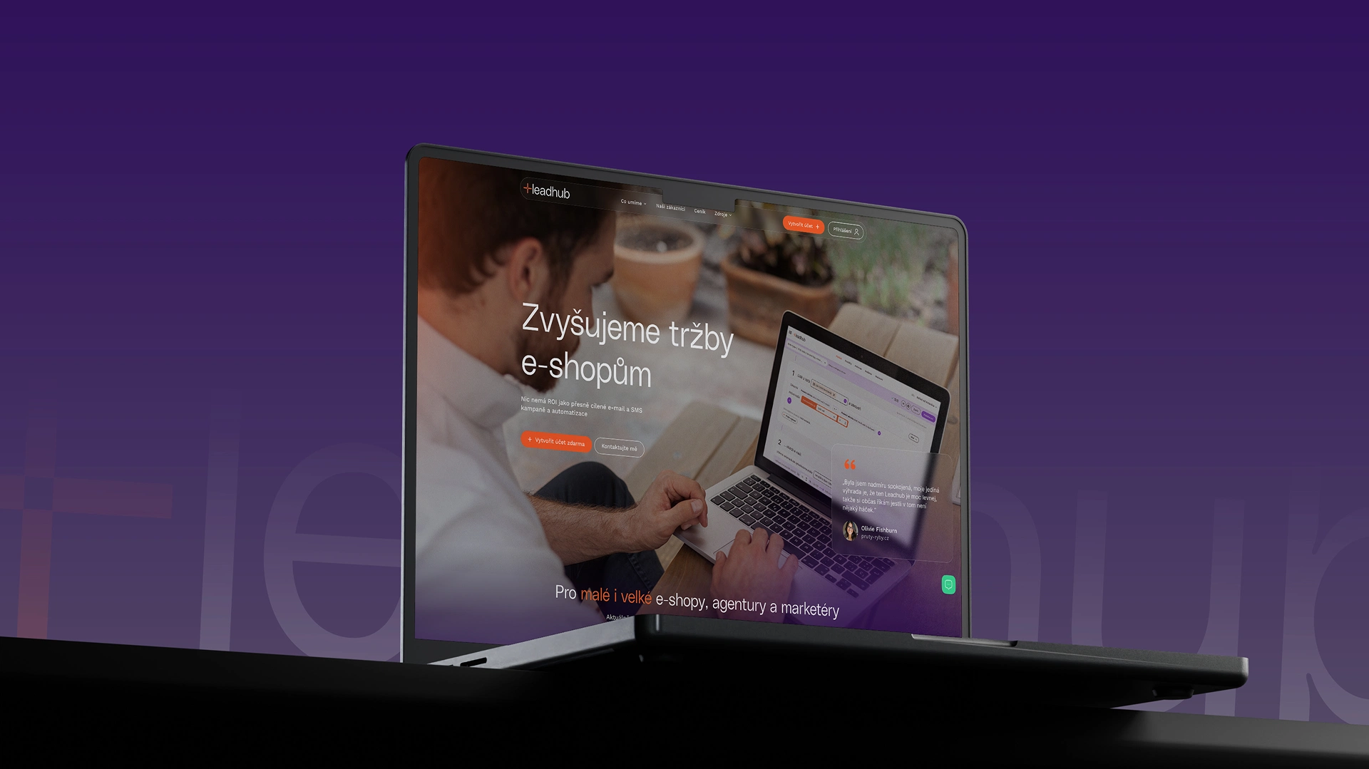
About the project
- A unified brand across both the website and the product
- Visual differentiation in a crowded, competitive space
- A modernized, more usable application
Leadhub needed to strengthen its market position and clearly stand apart from competitors whose branding leans heavily on shades of green. The goal was a cohesive website that properly introduces Leadhub and its features, showcases reference projects and brand milestones — and, alongside that, a modernized application UI with improved usability.
Beyond the website and product, we also put together a basic style guide for the most commonly used materials.
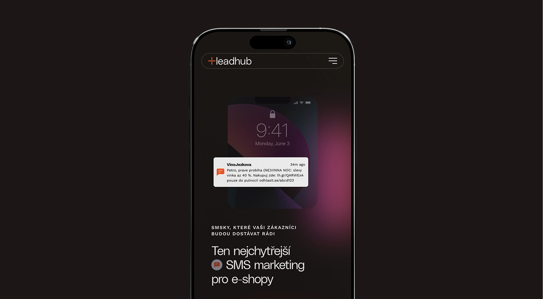
Business challenges and solutions
- Strengthen Leadhub's position in the market
- Differentiate the brand from competitors (often built around shades of green)
- Present features, references, and achievements in one cohesive story
Leadhub operates in a market where competitors look visually similar and often share the same color palette.
We needed to find a visual direction that would set the brand apart, while also building a website that clearly communicates the product, its features, and its real-world results and references — all in one place.
Design challenges and solutions
- Define a visual direction that breaks from the industry's "green" standard
- Unify the visual language across the website and the application
- Improve usability and modernize the product's UI
The key was to land on — and align around — a visual direction. So we started with art direction, moodboarding, and clustering possible directions. From there, we built the website’s UX (information architecture, wireframes) and then the UI, including micro-interactions.
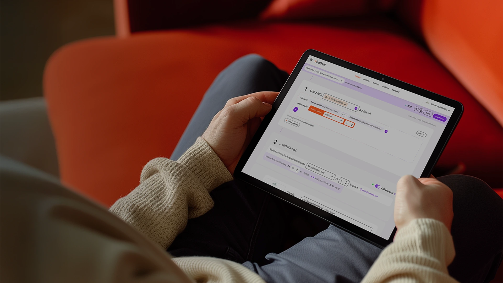
For the application, we focused on modernizing the UI and improving usability, designing the core visual style and key screens. To make sure the website and product spoke the same visual language, we built a single design system covering both.
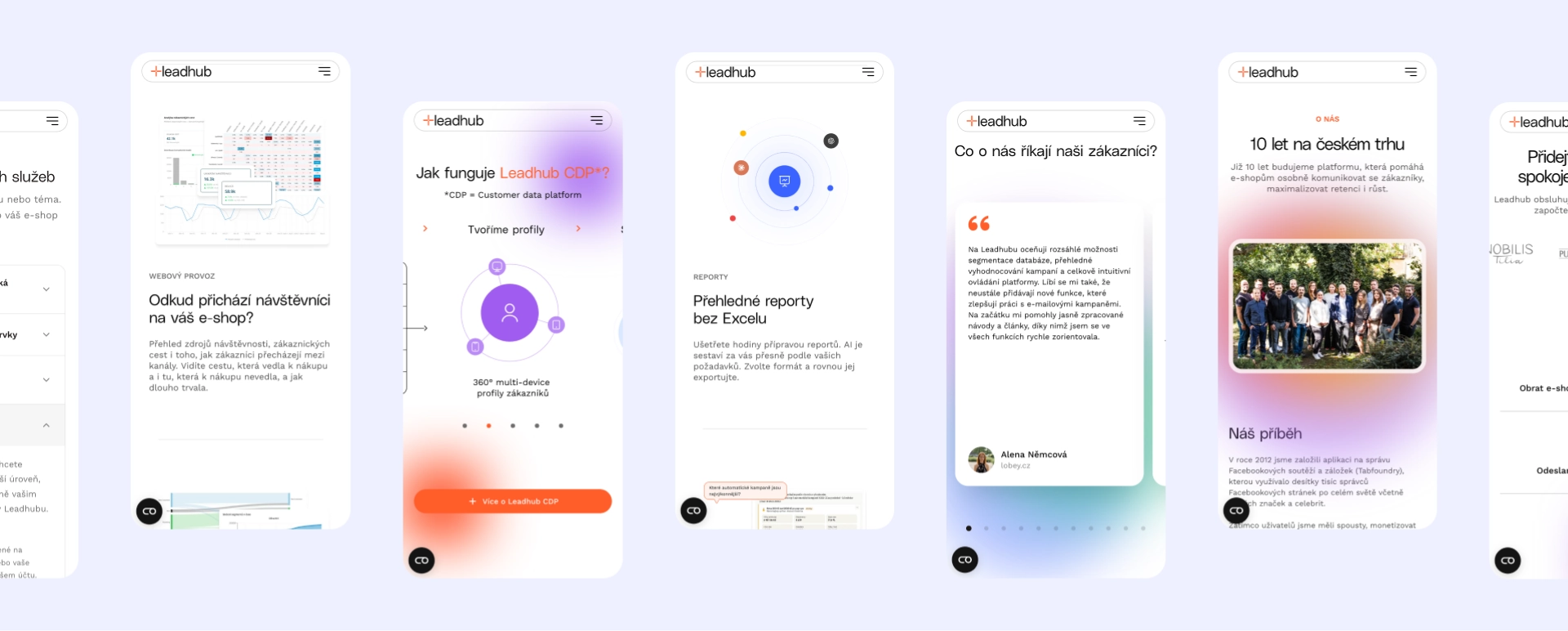
Development / custom tech challenges and solutions
- Development was handled by Leadhub's internal team
Leadhub’s own team implemented both the website and the application.
Our role covered UX, UI, visual direction, and the design system — so we built the designs and components to be handed off directly to the internal team to take forward and develop.
Our approach
We ran the project as a close collaboration with the Leadhub team — from joint workshops, through iterations on the visual direction, to fine-tuning the details. The design system was built to serve both the website and the application, and to support Leadhub’s internal development going forward.
- UX workshops to define the website’s goals and information architecture
- Art direction and moodboarding to define the visual direction and cluster variations
- UX design / website wireframes
We designed the core visual style for the application, its key screens, and the design system. The process involved countless joint sessions with the client, workshops, and detail work — including the graphic design of individual elements.
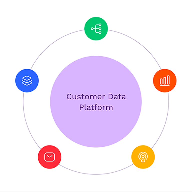
Key parts of the solution
- A cohesive website presenting Leadhub's features, references, and achievements
- A visual direction that sets the brand apart from the competition
- An application UI with improved usability and a modern look (key screens)
The “hero moment” of the project is bringing two worlds — the website and the application — together under one visual language and design system, rounded out with micro-interactions and detailed graphic treatment that give the brand its character.
The design system was shared between the website and the product.