
Macromo website design that makes data meaningful and gives the brand global ambition

About the project
- Intuitive UX design
- Modern UI on par with world-class startups
- Interactive, animated UI and content
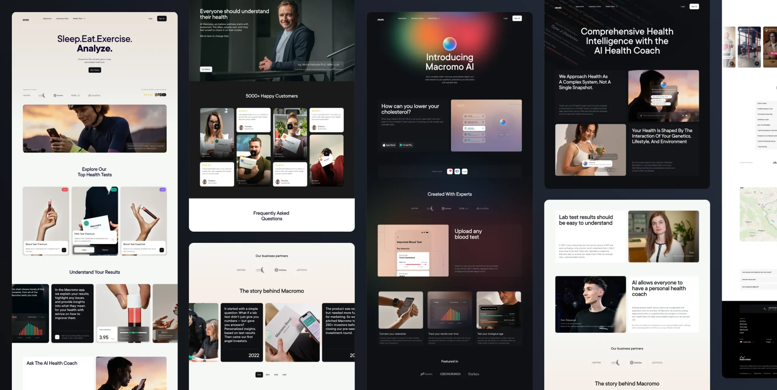
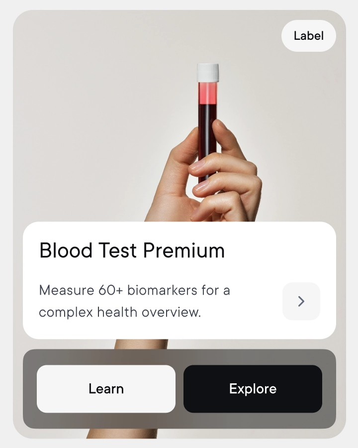
Macromo is a digital platform built around health and laboratory data. The goal was to design an engaging UX and UI solution with a strong focus on interactive content that could interpret complex data clearly, while capturing Macromo’s vision and brand identity.
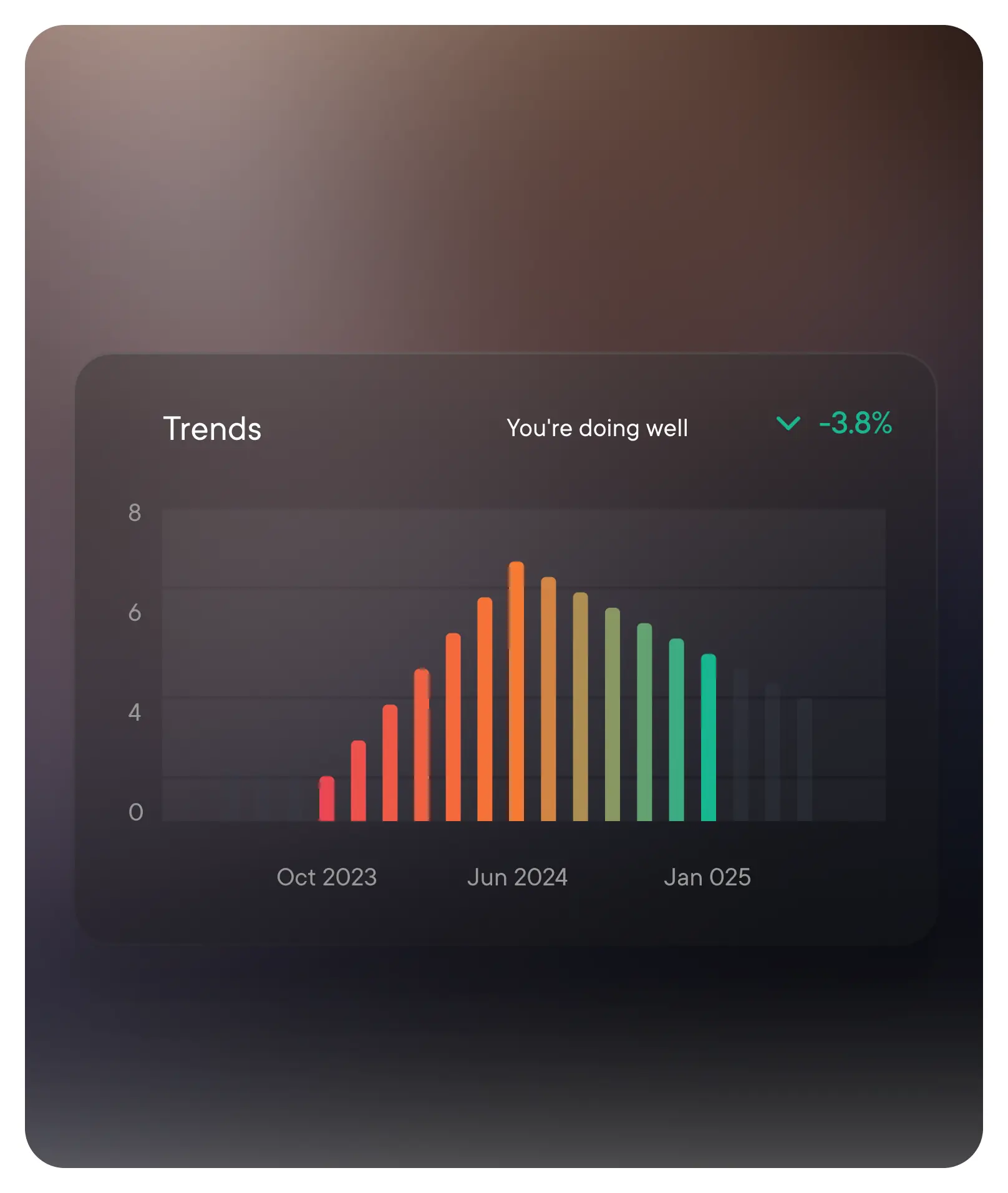
The website was designed to combine strong visual appeal with functional clarity. Interactive visualizations, thoughtful motion design, and a clear information hierarchy help users grasp the meaning of the data without requiring deep technical knowledge while also supporting Macromo’s ambition to reach an international audience.
Challenges
The main challenge was designing a visual and UX concept that could bridge a specialized healthcare context with a simple, human, and approachable interface that matched the ambitions of a startup aiming to go global.
The design had to handle a large volume of information, multiple data types, and users with varying levels of expertise. We needed an interface precise enough for a specialized context, yet clear and accessible for everyday users without a medical background.
Design challenges and solutions
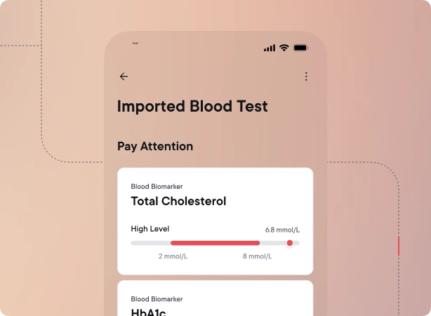
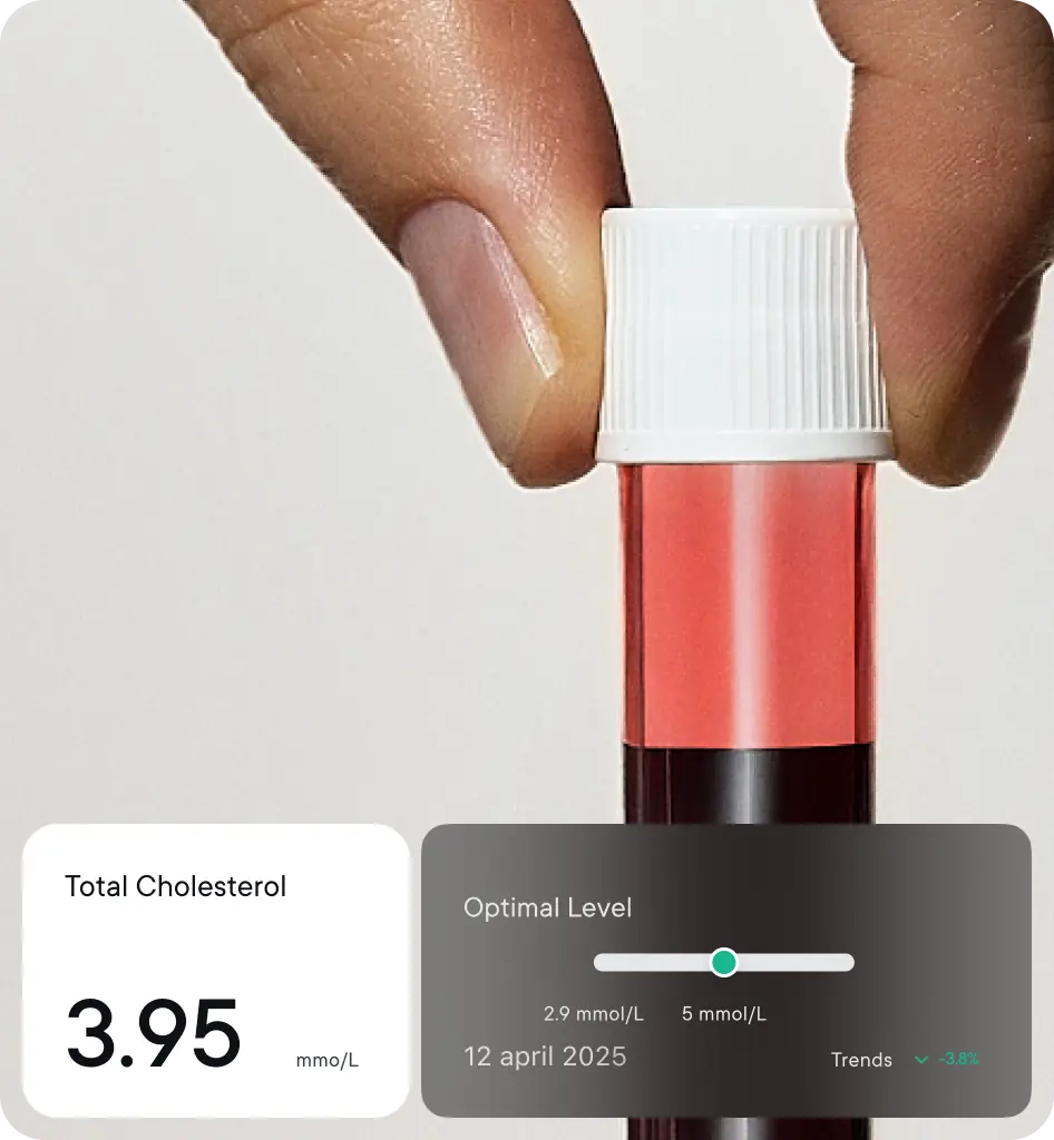
- Translating complex laboratory data into clear visual structures
- Establishing a clear visual hierarchy for fast orientation
- Crafting a design that resonates with an international audience
Part of the challenge was working in close alignment with the Macromo team, especially CEO Eva Kuttichová, a trained designer herself. That gave the project a clear vision, high standards, and a well-prepared brief from the start. Collaboration took the form of an ongoing dialogue around visual principles, interactions, and the overall feel of the product.
The final design wasn’t the result of a single concept. It took extensive iteration: testing different animations, transitions, and visual compositions along the way.
Through continuous refinement, we arrived at a solution that not only interprets the data clearly, but also fully meets the client’s expectations and Macromo’s brand ambitions.
Our approach
- Designed clear UX for the key pages and created a new visual language for presenting Macromo online
- Defined project roles, with the CEO directly involved
- Iterated through many variations of pages, modules, and detailed interactions
We started the project with a deep dive into user scenarios and the types of data Macromo works with.
Based on that, we defined the visual principles: hierarchy, color, and typography. The design evolved iteratively through sketches and visual concepts, with a focus on readability, consistency, and a calm visual tone.

Impact
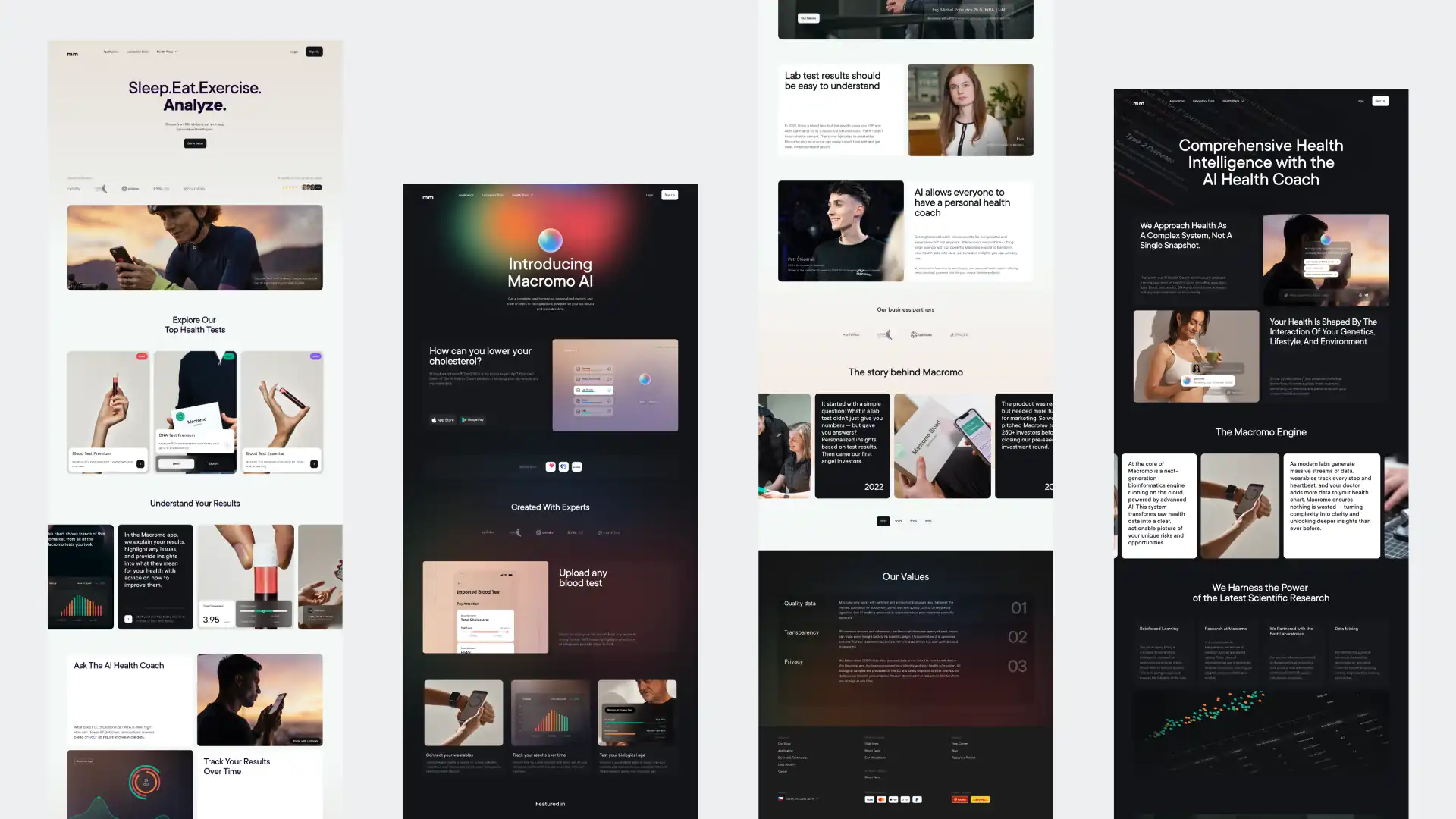
The result is a strong visual language for Macromo’s website that clearly conveys its product and goes into detail across every section, building trust and clarity around what Macromo offers.
Overall, the website represents the Macromo brand and product on a global scale.